
Most service business websites have too much content and not enough conversion architecture. Here are the 7 specific elements that separate sites that generate leads from those that just exist.
The 7 Elements Every Service Business Website Needs to Convert Visitors
A service business website that converts visitors into leads doesn't look dramatically different from one that doesn't. The distinction isn't in the visual design or the technology. It's in seven specific structural elements — and whether each one is present, specific, and doing its job.
Most service business websites have some of these elements. Few have all seven. And the ones that are missing are almost always the reason the site isn't generating the leads it should be.
This isn't a design checklist or a generic CRO list. These are the seven elements that research consistently identifies as the highest-leverage conversion factors for professional services websites — backed by data on what actually moves the needle when someone lands on your site.
Read more: Why Your Website Isn't Generating Leads (And It's Probably Not What You Think)
Key Takeaways
- Landing pages with a clear value proposition have a 34% higher conversion rate than those without (Invesp, 2024)
- Reducing a form from 11 fields to 4 boosted conversions by 120% in a documented case study (VentureHarbour / Imagescape, 2024)
- Sites with video convert at 4.8% vs. 2.9% without — an 86% higher conversion rate (Wyzowl, 2025)
- 93% of consumers say online reviews impact their purchase decisions (PowerReviews via Intelemark, 2025)
- Consistent brand presentation across all platforms increases revenue by up to 23% (Lucidpress + Demand Metric)
Element 1: A Specific, Problem-First Value Proposition
The first thing every visitor does when they land on your site is answer — consciously or not — the question: "Is this for me?" Your value proposition answers that question. And it needs to answer it in under five seconds, in plain language, without requiring any scrolling.
Most service business value propositions fail this test. They either describe what the business does ("We provide digital marketing services for businesses") or make a claim without substance ("We help you grow"). Neither tells a qualified prospect what problem you solve, for whom, or with what result.
A specific, problem-first value proposition has three parts:
- The problem or situation you address (specific enough that the right person recognizes themselves)
- The outcome you produce (a measurable or concrete change, not a vague improvement)
- Who it's for (explicit enough to exclude the wrong prospects)
Example of a generic VP: "We help businesses grow with digital marketing." Example of a specific VP: "We build integrated digital growth systems for service businesses that are tired of depending on referrals for 80% of their revenue."
Landing pages with a clear, specific value proposition have a 34% higher conversion rate than those without (Invesp, 2024). That improvement doesn't come from better design. It comes from the prospect recognizing themselves in the first sentence and feeling like they've found the right place.
What to do: Write your value proposition as a single sentence that completes this structure: "We help [specific client type] achieve [specific outcome] by [brief mechanism or differentiator]." Put it as your hero headline. Test it. If it accurately describes who you serve and what you deliver, it will convert better than any variation that hedges.
Element 2: A Single, Visible Primary CTA
Every service business website needs one primary conversion action — one thing you want most visitors to do. And that action needs to be visible above the fold, before the visitor has to scroll.
The research on CTA focus is consistent: single-CTA pages convert at 13.5% on average; as the number of CTAs increases, conversion drops because visitors face decision paralysis (Unbounce, 2024). That applies to landing pages, but the principle holds for homepages too.
For most service businesses, the primary CTA should be "Book a discovery call" or "Get a free audit" — something with low perceived commitment that starts a conversation rather than demanding an immediate sale. Secondary CTAs (case studies, newsletters, social follows) belong in the footer or in later sections — not competing with the primary conversion path in the hero area.
Placement matters as much as number. CTAs above the fold — visible without scrolling — show 73% higher visibility rates than those below the fold. And CTA button color, while secondary to placement and copy, does influence clicks: HubSpot's A/B testing found red CTAs outperform green by 21%, and CXL's research identifies high-contrast colors (orange, red) as consistently outperforming low-contrast options (CXL, 2025).
What to do: Audit your homepage. Identify the primary action you want visitors to take. Remove every competing CTA from the hero section. Make the primary button high-contrast, specific ("Book a Free 30-Minute Strategy Call," not "Contact Us"), and visible above the fold on both desktop and mobile.
Element 3: A Short, Friction-Free Form
The form is where intent becomes lead. It's also where most service businesses introduce unnecessary friction and watch conversions drop.
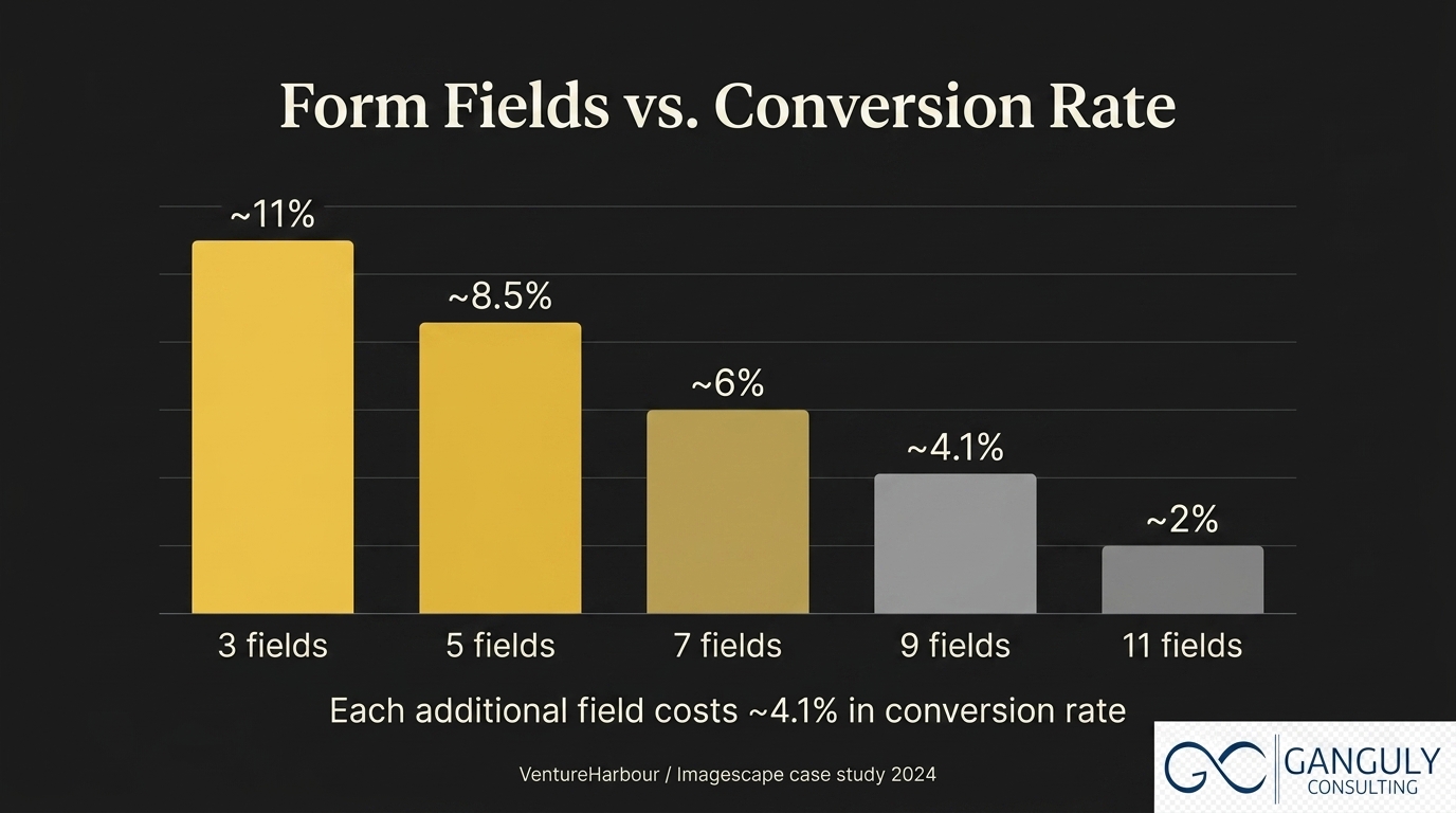
The data is direct: reducing a contact form from 11 fields to 4 boosted conversions by 120% in the Imagescape case study (VentureHarbour, 2024). Each additional form field reduces conversion rate by an average of 4.1%. B2B forms with more than five fields see an average 30% conversion decrease.
For a discovery call offer, four fields are sufficient:
- Name
- Company name (or "What do you do?")
- One qualifying question ("What's your biggest challenge right now?")
The qualifying question serves double duty: it pre-qualifies the lead and gives you context for the first email or call. It's also the question that makes the form feel conversational rather than administrative — which reduces form abandonment.
Phone number should not be on a top-of-funnel form unless your process requires it. It's the single field most likely to cause abandonment among people who are still evaluating whether to reach out.
What to do: Count the fields on your primary contact form. If there are more than five, remove the least essential ones. Test a four-field version against your current form. The conversion improvement will be visible within 30–60 days.
Element 4: Video — The Highest-Leverage Trust Builder
Video is the element most service business websites either use poorly or skip entirely. The data makes the case for including it clearly.
Sites with video convert at an average of 4.8% compared to 2.9% for those without — an 86% higher conversion rate (Wyzowl, 2025). 83% of consumers say they've been convinced to buy or book after watching a video about a product or service. 91% of businesses now use video as a marketing tool — meaning its absence is increasingly visible.
For a service business, video does something that copy cannot: it lets the prospect see the founder or lead consultant before a call. That pre-call familiarity changes the dynamic of the discovery conversation. The prospect has already formed a view of you — your communication style, your credibility, your personality. They're not coming into the call cold. They're coming in with context.
The right video for a service business homepage or landing page is not a polished agency production. It's a 60–90 second founder video with one clear message: who you work with, what problem you solve, and what happens on a discovery call. Recorded on a decent camera, in good light, with clear audio. That's it.
Video testimonials are even higher-leverage. Landing pages with video testimonials convert at 39% compared to 22% for written-only testimonials — a 77% uplift (Influencer Marketing Hub, 2025). A 60-second video of a client describing their situation before working with you, and their situation after, does more conversion work than five paragraphs of written copy.
What to do: Record a 60–90 second founder video. Talk directly to camera. Address your ideal client's problem in the first 10 seconds. Place it on your homepage, above the fold or immediately below the hero section. If you have a client willing to record a 60-second testimonial, prioritise getting that on your primary landing page.
Element 5: Named, Results-Based Social Proof
Social proof is one of the most researched conversion factors in digital marketing. 93% of consumers say online reviews and testimonials impact their purchase decisions (PowerReviews via Intelemark, 2025). Websites with user-generated content — testimonials, reviews, case study excerpts — see 29% higher web conversion rates.
But the type of social proof matters as much as its presence. "Great service, highly recommend" is noise. A testimonial that names the client, describes their situation before engaging with you, and cites a specific result is signal.
The structure of a high-converting service business testimonial:
- Name and role: Sarah Mitchell, COO, Clearfield Advisors (not just "S.M., COO")
- The before: "We were spending $4,000/month on ads with no way to track which leads became clients"
- The after: "Three months in, our CPL has dropped 31% and we can see exactly which campaigns are working"
Three testimonials built to this structure, from clients who represent your ideal prospect profile, will outperform 20 star ratings or generic praise quotes.
Case studies extend this further. 73% of B2B decision-makers say case studies significantly influence their purchasing process (DemandGen Report, 2023). Even a one-page case study on your site — situation, approach, result — gives a prospect something concrete to evaluate before they book a call.
What to do: Reach out to your three best clients for a testimonial written to the structure above. Offer to draft it for them based on what you know about their results — most clients will approve a well-written draft rather than writing one from scratch. Add the approved testimonials to your homepage and primary landing page this week.
Element 6: Clear, Fast Mobile Experience
61% of B2B buyers now prefer a rep-free buying experience — and most of that research happens on mobile (Gartner, 2025). If your site doesn't perform on mobile, you're failing the majority of your prospects at the first interaction.
The specific issues that kill mobile conversions for service businesses:
- Load time over 3 seconds: 53% of mobile users abandon a site at this threshold (Google)
- CTAs that require horizontal scrolling or are hard to tap: Mobile buttons need to be large enough to tap with a thumb — at least 44×44 pixels
- Copy that's too dense for mobile reading: Paragraphs that work at desktop width become unreadable walls of text at 375px. Break up paragraphs. Shorten sentences. Use bullets where appropriate.
- Forms that don't work with mobile autofill: Every form field should support autocomplete attributes so browsers can fill them automatically. Friction from typing on a small keyboard is a real conversion killer.
Responsive designs — that adapt layout to screen size — have 11% higher conversion rates than non-responsive sites across comparable traffic (Linear Design, 2025). That gap will continue to widen as mobile traffic grows.
What to do: Visit your homepage on your phone. Without touching anything, ask: can you read the headline clearly, is the CTA button tappable without zooming, and does the page load in under 3 seconds? If the answer to any of these is no, you've identified a conversion gap that's costing you leads from every mobile visitor.
Read more: Why Your Website Isn't Generating Leads (And It's Probably Not What You Think)
Element 7: Brand Consistency That Signals Premium
The final element is the one most service businesses think they have and don't: brand consistency. Not visual consistency — although that matters — but the consistency of message, tone, and positioning across every page, every platform, and every touchpoint.
Consistent brand presentation across all platforms increases revenue by up to 23% (Lucidpress + Demand Metric, named study). For premium service businesses, where a prospect might encounter you first on LinkedIn, then read a blog post, then visit the homepage, then read a case study — the consistency of that experience is what builds or breaks trust at scale.
What brand consistency looks like in practice:
- The language you use to describe your clients' problem on LinkedIn is the same language you use on your homepage
- The visual tone of your website — colors, typography, photography style — matches what you post on social media
- Your bio on every platform says the same thing about what you do and who you do it for
- The voice in your emails, proposals, and follow-up messages sounds like the same person as the voice on your website
For a service business, brand consistency is a proxy for organisational trust. If your LinkedIn says one thing about what you do and your website says another, a sophisticated prospect notices — and doubts your ability to communicate with precision with their clients.
What to do: Audit your homepage positioning statement against your LinkedIn headline. Read the first paragraph of your website copy and the first paragraph of your last LinkedIn post. Do they sound like the same person, making the same claim, to the same audience? If not, align them. The homepage should always be the master — every other touchpoint should reflect it.
Putting the 7 Elements Together
None of these elements work in isolation. A specific value proposition without a visible CTA leaves visitors knowing what you do but not knowing what to do next. A single CTA with a 10-field form loses people at the last step. Strong social proof on a slow mobile site never gets seen.
The seven elements work as a system:
- The value proposition gets the right person to stay
- The primary CTA tells them what to do
- The short form makes doing it easy
- The video builds enough trust to act
- The social proof confirms the decision
- The mobile experience ensures the stack works for most traffic
- The brand consistency makes every touchpoint reinforce every other
A website built with all seven elements — not as a redesign project but as a deliberate audit and improvement process — routinely converts 5–12% of paid traffic into leads. Most service business sites convert 1–2%. The gap is almost always explained by which of these seven elements is missing or underbuilt.
You don't need all seven to start. Pick the one with the biggest gap on your current site and fix it this week. Then move to the next.
Read more: The Complete Guide to Building a Digital Growth System for Service Businesses
Frequently Asked Questions
Do I need all 7 elements on my homepage, or can some be on other pages?
The value proposition, primary CTA, and form should be on every primary page — homepage and landing pages. Video works best on the homepage and any high-traffic landing page. Social proof should be on both the homepage and the services/contact page. Mobile optimization and brand consistency apply site-wide. You don't need to pack all seven onto one screen — spread them through the page in a logical reading order, with the most critical (VP + CTA) above the fold.
How often should I update my value proposition?
Review it every six months or whenever your client mix, service offering, or competitive landscape changes meaningfully. The most common reason a value proposition stops converting is that the business evolved but the homepage copy didn't. If you're attracting the wrong type of prospect or getting fewer quality enquiries, the VP is the first thing to audit.
Is a website video necessary if I'm camera-shy?
Not strictly necessary, but high-impact when done. If recording yourself is a genuine barrier, start with a screenshare walkthrough of a client case study, or a voiceover presentation of your process. Either is better than nothing and avoids the need to be on camera. Video testimonials from clients, if you can get them, are arguably more persuasive than a founder video anyway — prioritise those first if personal camera presence is the obstacle.
What's the fastest way to add strong social proof without existing testimonials?
If you have no existing testimonials, the fastest path is to reach out to two or three recent clients with a specific, pre-written request: "Would you be willing to record a 30-second voice note or write two sentences about the result you saw?" Most clients will say yes if the request is specific and easy. Alternatively, document one client result in your own words as a case study — "a client in [industry] came to us with [problem] and achieved [result]" — and add it to your site immediately. Anonymised case studies are better than no social proof.
How long does it take to see conversion improvement after making these changes?
Changes to the value proposition and CTA produce visible results within 2–4 weeks if your traffic volume is sufficient (100+ visitors/week). Form simplification results typically appear within 30 days. Video additions compound over time — they tend to improve the quality of leads, which shows in call-to-close rates rather than raw form submissions. Set up GA4 goal tracking before making any changes so you have a baseline to compare against.
A Website That Converts Is a Business Asset
Most service business websites cost money every month — hosting, maintenance, ad spend to drive traffic — without returning a measurable multiple of that investment. A website built with these seven elements changes that equation. It becomes an asset that works at every hour of the day, qualifying prospects before they speak to you, building trust before the first conversation, and moving the right people toward booking a call without anyone manually doing anything.
The investment required isn't a full redesign. It's seven specific improvements, each backed by evidence, each independently measurable. Start with the element that's most obviously missing. Build from there.
The businesses that convert consistently aren't the ones with the most sophisticated websites. They're the ones where every element is present, specific, and doing its job.
Read more: How to Build a Lead Generation System That Doesn't Depend on Referrals
Abhisek Ganguly is the founder of Ganguly Consulting, a premium tech and growth consulting firm that helps service businesses build integrated digital growth systems. Ganguly Consulting works at the intersection of technology, marketing, and business strategy.